Rebuilding Student Companion App
Every student needs that one app they keep coming back to — to check attendance, courses, schedules, all of that. I already had one, but over time it just started to feel... outdated. It worked, sure, but using it wasn't exactly pleasant.
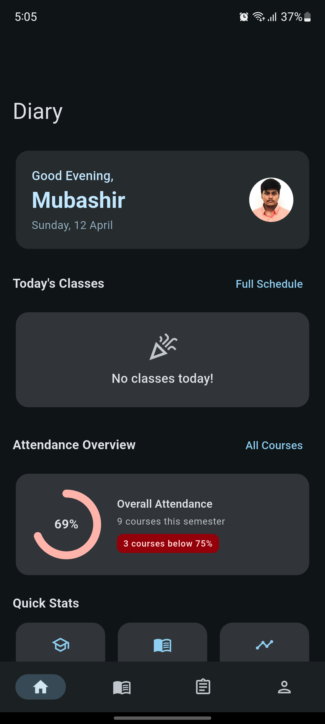
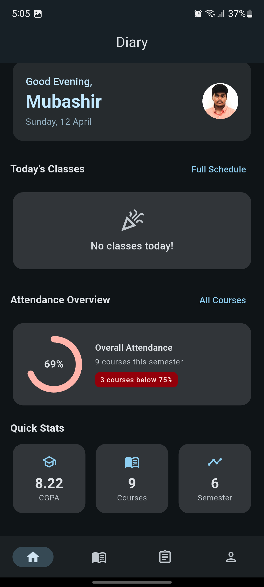
So I decided to rebuild it from scratch as Student Buddy, this time focusing just as much on how it feels as how it works.
The Problem with the Old App
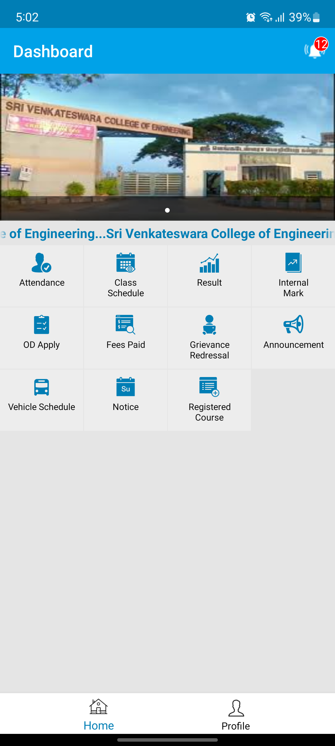
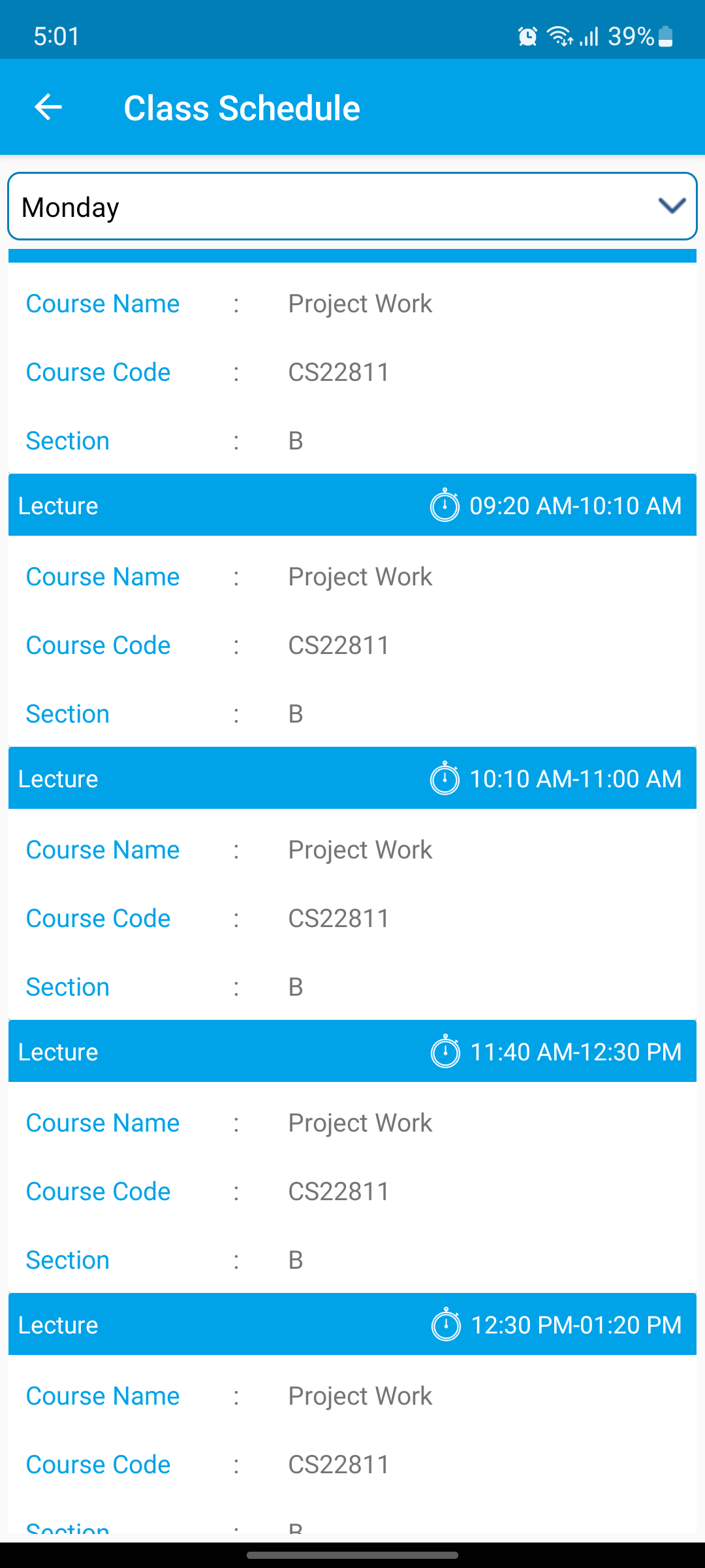
The old app, “SVCE Student Diary”, did what it was supposed to do. You could check your schedule, track attendance — the basics were covered.
But everything else felt stuck in the past.
The UI had hard-coded colors, flat layouts, and no real sense of structure. It looked like something straight out of the Android 4.x days. On top of that, navigation felt clunky and the screens were packed with too much information at once.
It wasn't broken, but it wasn't something you'd wantto use either. And for an app you open almost every day, that matters more than you'd think.
The old Student Diary
Enter Material 3 & Dynamic Color
When I started rebuilding, Material 3 felt like the obvious choice.
The biggest win was dynamic color. On Android 12+, the app automatically picks up colors from your wallpaper and builds the entire theme around it. It sounds like a small thing, but it makes the app feel way more personal right away.
Beyond that, Material 3 gave me a solid design system to work with — better hierarchy, cleaner layouts, and components that actually guide the user instead of confusing them. Things like large top bars, proper spacing, and clearer grouping made a huge difference.
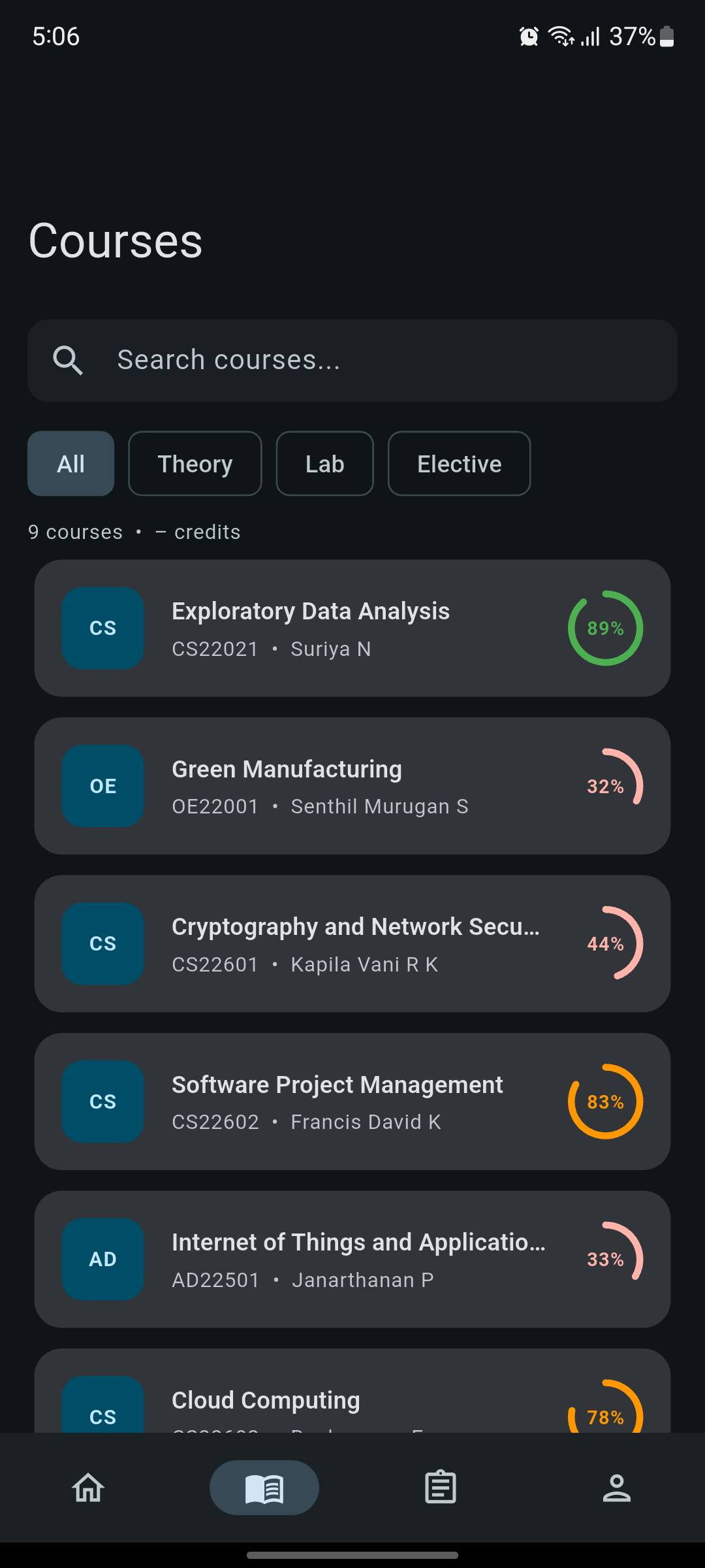
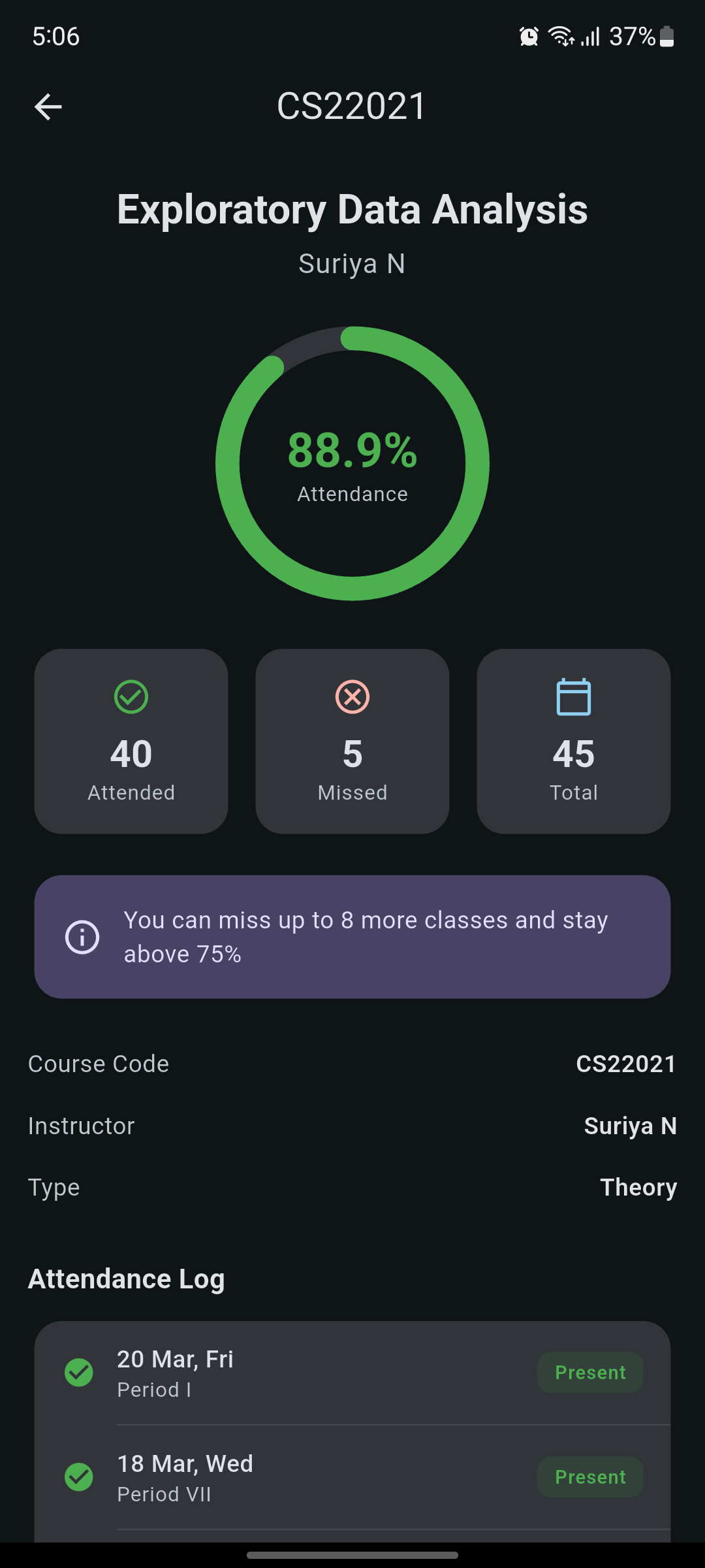
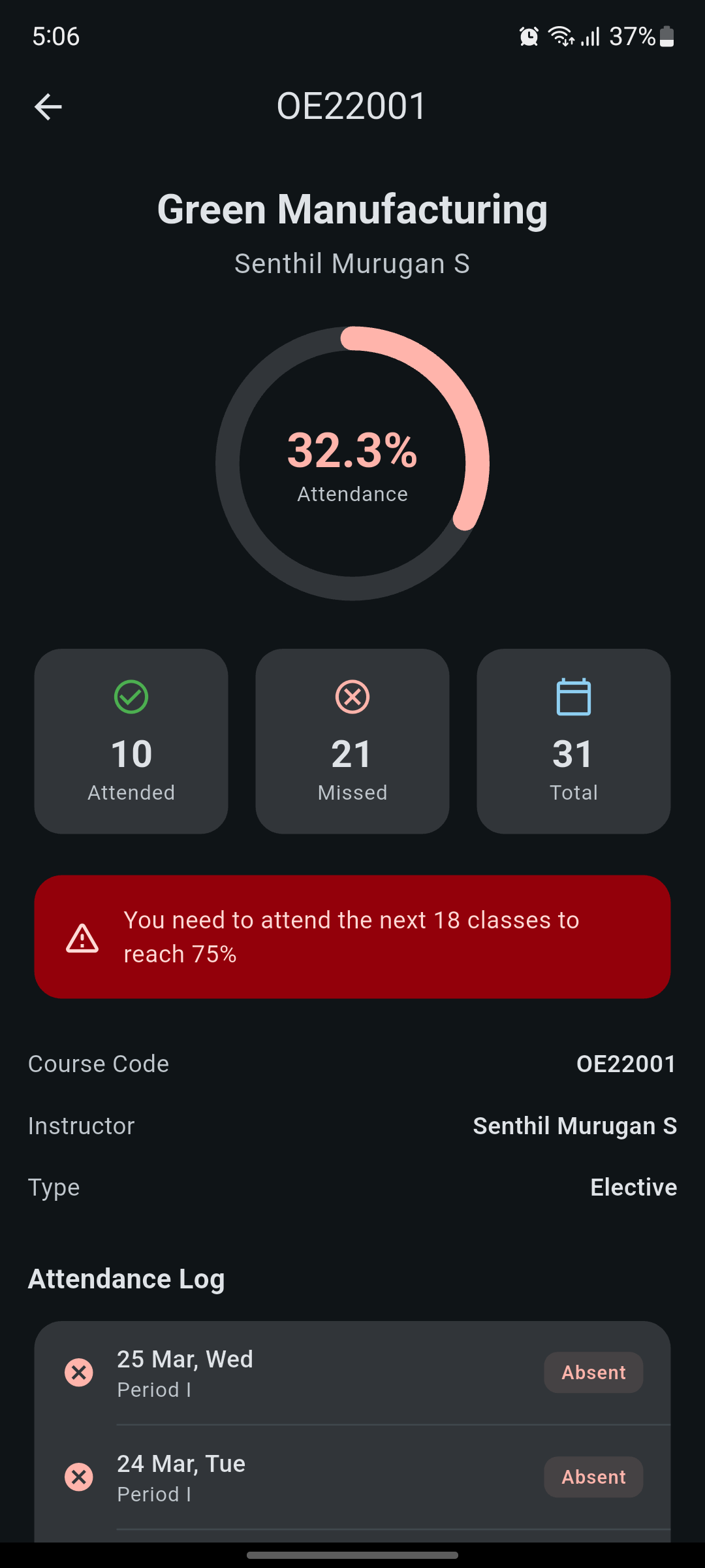
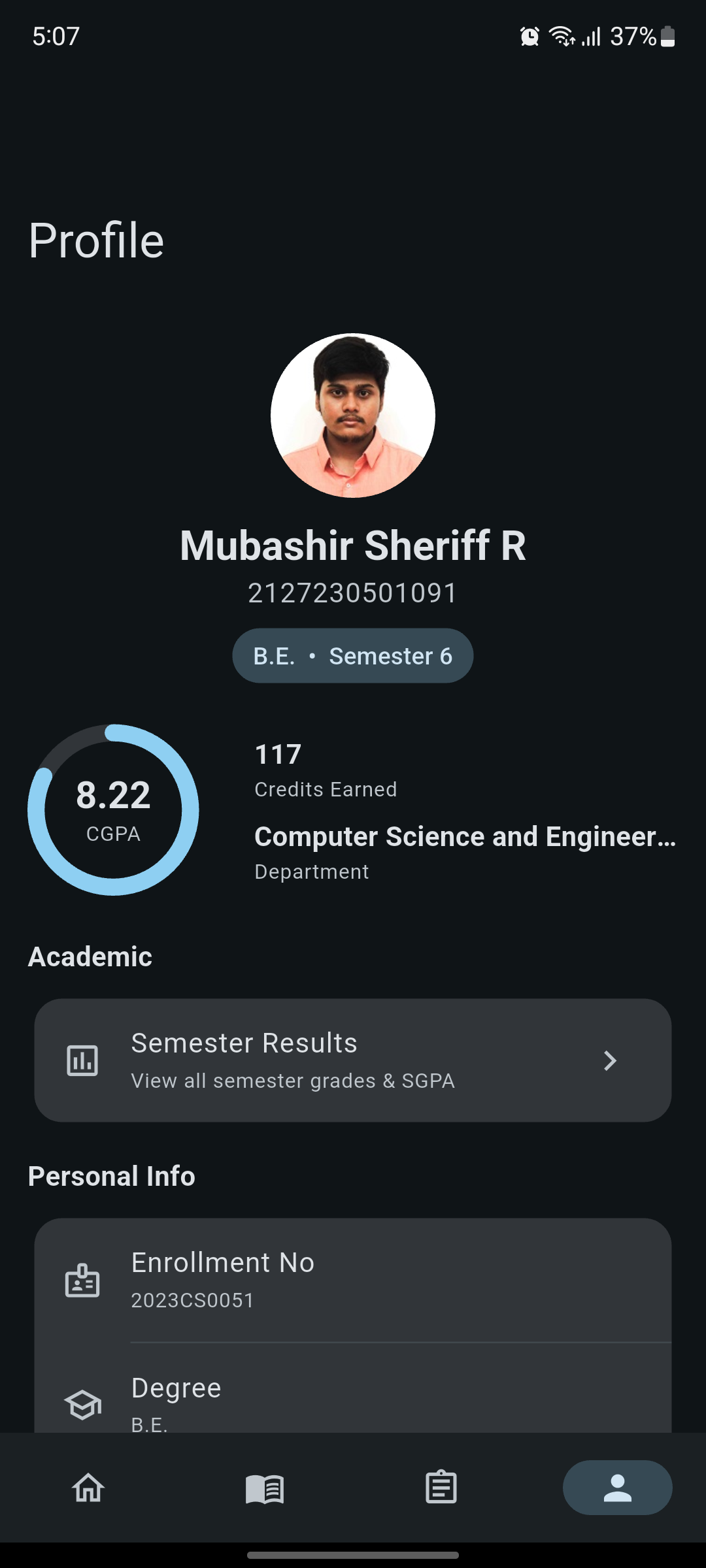
The new Student Buddy
The Verdict
Rebuilding this app wasn't just about making it look better — it was about making it feel better to use.
Now it actually feels like something that belongs on your phone, not something you're forced to open. Navigation is simpler, information is easier to scan, and overall it just gets out of your way.
If you're a student and want something clean and modern to keep track of your academics — or if you're just curious about Material 3 in action — give it a try.
Download Student Buddy
Available for Android — free and open source